( 01 Journal )
Identity
04 Aug 2026
11 min read

Mara Ellison
Partner, Strategy
Pl. 01 Regional control room, first site visit
A national energy operator formed from twelve regional companies, none of whom wanted to lose their name. We agreed to run the whole identity process where their staff could watch it, which was not the plan we proposed.
The merger had been announced eighteen months before anyone called us. In that time each region had drawn its own conclusion about what would happen to it, and most of those conclusions were wrong in the same direction: someone in the capital would decide, and the sign on their building would change overnight.
What actually happened was slower and more argued, and the arguing is the part worth writing down.
Two things survived the first workshop, and both surprised us. The first was the regional numbering — every substation, van and work order in the north-west carried a four-digit code that engineers could read at forty metres. The second was a colour that four of the twelve regions had independently landed on, for the practical reason that it holds up under sodium lighting.
We had arrived expecting to design a mark and a typeface. We left the first week with a constraint list instead:
Legible on a substation door at four metres, at night, in rain
Printable by twelve different local suppliers with no colour management
Applicable by an engineer with a vinyl kit and no design training
Survives being photocopied onto a work order
None of those are brand problems in the way the brief described them. All four decided the design.
The substation door set the type size, and the type size set everything else.
Field note, week three
The name. Copperline was one of the twelve, the smallest by revenue and the oldest by a century, and the argument for using it was that it was the only word in the room nobody had to explain. The argument against it was that eleven regions would read it as a takeover, which is a reasonable thing to read.
We ran the objection openly rather than around it. Every region was shown the same three routes, including the one that kept their own name at the front. The response we did not expect was how quickly the engineers stopped caring about the name once they saw the numbering survive intact.
What settled it was not a presentation. It was a mock-up taped to a real door in Rotherham, photographed at 22:40, and circulated without commentary.
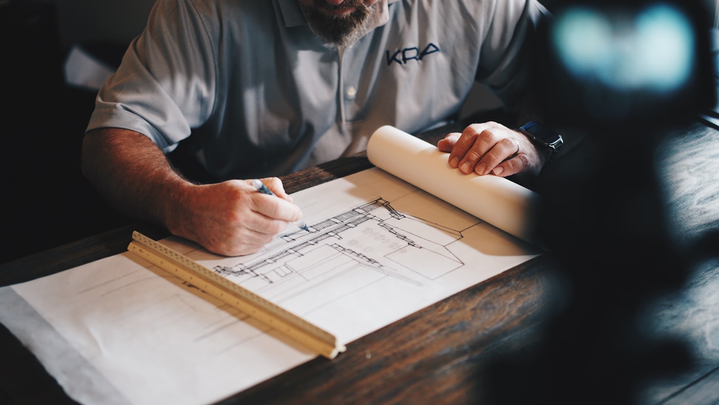
Pl. 02 Door proofs, sodium-light test
Every review was open to anyone in the company who wanted to sit in, and the recordings went on the intranet the same afternoon. Roughly sixty people watched the first, four hundred watched the fourth, and by the end we were being corrected on technical detail mid-sentence, which is the useful version of an audience.
It cost us about a day a week and it removed the launch entirely. There was no reveal, because there was nothing left to reveal. The identity arrived the way a decision arrives in a company that has been arguing about it for four months: unremarkably, and with everyone already using the words.
Open the process earlier. We spent the first three weeks in head office because that is where the brief came from, and the first honest conversation happened in a depot canteen in week four. Everything before that was preparation for the actual project.
Filed under Identity · 04 Aug 2026
Let's make
something
lasting